Archive for the ‘Silverlight’ Category

Data Templates Implementation Outside of WPF

May 28, 2014

Data Templates Implementation Outside of WPF

Code Location

The code for this blog post can be downloaded from
NonWPFDataTemplatesTests.zip.

Introduction

Here I continue a series of blog posts regarding implementing WPF
concepts outside of WPF.

WPF is built around a hierarchy of visual objects the so called
Visual Tree. Any WPF control can provide an example of such hierarchy –
e.g. a WPF window might contain a grid panel which in turn contains
a number of visual objects e.g. buttons and list boxes which in turn contain
some text etc.

The object hierarchy is usually built in XAML with the help of numerous
techniques such as bindings, Control Templates and Data Templates.
Data Templates with the help of bindings
allow to translate some non-visual objects into visual objects with the
hierarchy defined by XAML. These resulting visual objects usually mimic the behaviors of the original non-visual objects – e.g. Changing a property on a
non-visual object would result in the corresponding visual property change,
adding or removing an object to or from an observable collection would result
in a corresponding item being added or removed from e.g. a ListView.

This blog entry will show how to use concepts similar to WPF Data Templates
outside of WPF and apply them for creating in XAML purely non-visual objects.

I’d like to stipulate that the utility of the concepts introduced
here might not be quite obvious yet. The usage of non-visual data templates
will be explained in the future blog posts.

Also I would like to express gratitude to the WPF re-implementation attempt
called Avalonia. It would have taken me much longer to understand the inner workings of XAML
functionality without this project and also I am using a modified version of several of its classes: AvalonXamlReader, ContentLoader and TemplateContent in order to create the
non-visual Data Templates.

Data Hierarchy Code Description

Data Hierarchy

First of all let me describe the non-visual hierarchy that we
want to build.

The WPF’s visual hierarchy is based on the natural containment of visual objects. As was stated above a window might contain a panel – a panel further might contain other panels and controls etc.

The non-visual hierarchy that we deal with is Property Map and the classes
that represent that hierarchy are contained under NP.Paradigms.DataHierarchy project. In a sense it mimics the data hierarchy within JSON code: there are Fields, Property Maps, and Collections.

A Field would only contain a value of type object.

A Property Map corresponds to a C# object –
it has a number of named properties each has a value. The values can be plain Fields, other Property Maps or Collections. The name of a property is unique within the map object. I implemented such maps as a Dictionary with string keys
corresponding to the name of the property and values – the property value. In JSON such object would be shown within curly brackets:


{
name1 : value1,
name2 : value2
}

Collection is a collection of objects (usually of similar structure) that can be either Property Maps or Fields. In JSON collections are denoted by square brackets:


[
value1,
value2
]

Clearly our Data Hierarchy can be used to represent a very wide range of models – in particular anything that can be represented by JSON or C# classes and collections can be represented by the Data Hierarchy.

Classes Describing the Data Hierarchy

As was mentioned above all the classes describing our Data Hierarchy model are locate under NP.Paradigms.DataHierarchy project.

All the Data Hierarchy classes implement IPresentationTreeNode interface. This interface has Parent property that points from the current object to its parent within the Data Hierarchy. IPresentationTreeNode also extends IDataContextContainer interface that defines DataContext property that all the members of the hierarchy should implement. Just like in WPF, the DataContext property contains the data object from which the member of the hierarchy gets its values via binding.

There is also IPresentationTreeNodeWithChildren<T> interface that extends IDataContextContainer and in addition also defines a collection Children.

FieldPresenter class corresponds to a single value Data Hierarchy node. Its property TheValue contains the corresponding value. Its subclass TextFieldPresenter also allows formatting the values for text presentation.

CollectionPresenter defines a collection within Data Hierarchy by its property Children.

PropertyMapPresenter represents the Property Map nodes within Data Hierarchy. It implements IDictionary so that one can use the indexer notations (square brackets) to define the name-value mappings, e.g:
myMap["Name"] = value

Note that classes that implement Data Hierarchy nodes fire PropertyChanged events when their properties change. Also Children property of the CollectionPresenter is implemented as ObservableCollection and correspondingly fired CollectionChanged event when the items are changed within the collection (removed, added or moved). This is necessary so that the bindings that have the Data Hierarchy nodes as source would work.

Classes for XAML Composition using Data Templates

Classes used for XAML composition are also defined under NP.Paradigms.DataHierarchy project.

DHierarchyContentControl and DHierarchyItemsControl correspond to the WPF’s ContentControl and ItemsControl classes.

DHierarchyContentControl defines properties Content and ContentTemplate.
ContentTemplate defines the sub-hierarchy of the node while Content property allows to switch the data context of its sub-nodes.

DHierarchyItemsControl defines properties ItemsSource and ItemTemplate. ItemsSource should be bound to a collection of objects. ItemTemplate specified the structure of each of the sub-nodes within DHierarchyItemsControl‘s Children collection. The resulting Children collection behaves similar to the ItemsSource collection if an item is added or removed from ItemsSource the corresponding item will be added or removed from the Children collection.

There is a number of classes for reading and processing XAML data templates. Class DHierarchyDataTemplate is used for storing the Data Hierarchy data templates within DHierarchyContentControl and DHierarchyItemsControl. DHierarchyTemplateContent together with DHierarchyContentLoader and AvalonXamlReader control loading the data templates from XAML.

Usage Code Description

Here we describe how the Data Hierarchy code with data template capabilities can be used.

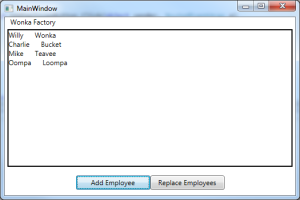
The mock up data is contained under MockUpObjects. Here we consider only two classes: Organization and Person. Both are very simple Organization contains its name and a collection of people. Person simply contains first and last name of the person.

The main project in NonVisualDataTemplates. It defines an organization as its resource:

  <MockUps:Organization x:Key="TheWonkaChocolateFactoryOrganization" />

Around the organization object it defines the Data Hierarchy data template. While on top of the Data Hierarchy data template it defines a visual representation (just in order to be able to see that it works).

Data Hierarchy representation is defined by the following templates:

<hierarchy:DHierarchyDataTemplate x:Key="EmployeeNonVisualDataTemplate">
    <hierarchy:PropertyMapPresenter>
        <hierarchy:FieldPresenter x:Key="FirstName" 
                                  TheValue="{winparadigms:Bind SourcePath=FirstName, 
                                                               SourceMode=DataContext}"/>
        <hierarchy:FieldPresenter x:Key="LastName" 
                                  TheValue="{winparadigms:Bind SourcePath=LastName, 
                                                               SourceMode=DataContext}"/>
    </hierarchy:PropertyMapPresenter>
</hierarchy:DHierarchyDataTemplate>

This template define the Data Hierarchy representation of a person (employee)

<hierarchy:DHierarchyDataTemplate x:Key="TheOrganizationTemplate">
    <hierarchy:PropertyMapPresenter>
        <hierarchy:FieldPresenter x:Key="OrgName" 
                                  TheValue="{winparadigms:Bind SourcePath=OrgName, 
                                                               SourceMode=DataContext}"/>
        <hierarchy:DHierarchyItemsControl x:Key="People"
                                          ItemsSource="{winparadigms:Bind SourcePath=People, 
                                                                          SourceMode=DataContext}"
                                          ItemTemplate="{StaticResource EmployeeNonVisualDataTemplate}"/>
    </hierarchy:PropertyMapPresenter>
</hierarchy:DHierarchyDataTemplate>

This template defines the whole organization with multiple employees.

DHierarchyContentControl ‘marries’ the organization template and the organization data:

<hierarchy:DHierarchyContentControl ContentTemplate="{StaticResource TheOrganizationTemplate}"
                                       Content="{StaticResource TheWonkaChocolateFactoryOrganization}"
                                       x:Key="TheDHierarchyContentControl"/>

In order to visualize the results, a plain visual WPF hierarchy is build around the
DHierarchyContentControl:

<Grid Grid.Row="0" 
      DataContext="{winparadigms:Bind Source={StaticResource TheDHierarchyContentControl}}">
    <Grid.RowDefinitions>
        <RowDefinition Height="Auto" />
        <RowDefinition Height="*" />
        <RowDefinition Height="Auto" />
    </Grid.RowDefinitions>

    <TextBlock Text="{winparadigms:Bind SourcePath=Child.-OrgName-.TheValue, SourceMode=DataContext}"
               Margin="10,0,0,0"/>

    <Border Grid.Row="1"
        BorderBrush="Black"
        BorderThickness="2"
        Margin="5">
        <ItemsControl ItemsSource="{winparadigms:Bind SourcePath=Child.-People-.Children, SourceMode=DataContext}">
            <ItemsControl.ItemTemplate>
                <DataTemplate>
                    <Grid>
                        <Grid.ColumnDefinitions>
                            <ColumnDefinition Width="Auto" />
                            <ColumnDefinition Width="Auto" />
                        </Grid.ColumnDefinitions>
                        <TextBlock Text="{winparadigms:Bind SourcePath=Child.-FirstName-.TheValue, SourceMode=DataContext}" />
                        <TextBlock Text="{winparadigms:Bind SourcePath=Child.-LastName-.TheValue, SourceMode=DataContext}" 
                                   Grid.Column="1"
                                   Margin="20,0,0,0"/>
                    </Grid>
                </DataTemplate>
            </ItemsControl.ItemTemplate>
        </ItemsControl>
    </Border>
</Grid>

Note that we are using Bind markup extension instead of Binding. This extension has been described in some of the previous blog entries.

Also note that ‘-‘ character around a path link specifies that this path link is actually a key inside a Dictionary for the Bind markup extension. Also SourceMode=DataContext means
that we are binding to the DataContext property (by default Bind extension binds to
the object on which it is defined, not to its DataContext).

There are two buttons at the bottom of the application that allow to modify the original Organization object. The very simple for modifying the original Organization is located in MainWindow.xaml.cs code behind file. You can add an employee or you can replace its People collection with another collection. These changes will cause changes in Data Hierarchy representation and those in turn will cause the visual representation to change.

After running the application (and pressing a button to add an employee) you’ll see the following picture:

Non-WPF Data Template Test App

Conclusion

We’ve shown implementing XAML data templates for non-WPF (and even non-Visual) objects.

Attached and Routed Events outside of WPF

December 1, 2013

Code Location

The code for this blog post can be downloaded from
AttachedRoutedEvents.zip.

Introduction

Here I continue a series of blog posts regarding implementing WPF
concepts outside of WPF.

In Attached Properties outside of WPF I introduced
a notion of AProperty – attached property implementation
outside of WPF. Unlike WPF attached property,
such property can be attached to any object –
not only to DependencyObject.

Just like AProperty can be added to an object
without modifying the object’s code, we can come up with the
REvent concept
similar to WPF’s attached event in order add an event to an
object without modifying the object’s code.

In Tree Structures and Navigation we were talking
about navigating a Tree from
node to node. The REvents can also be propagating
from node to node on a tree in a manner similar to that of
WPF’s RoutedEvents propagating on a visual tree.

Attached and Routed Events in WPF

Each event has 4 important actions associated with it:

  1. Defining an event
  2. Adding handlers to an Event
  3. Removing handlers from an Event
  4. Raising or Firing an Event from an object

In WPF and Silverlight one can use Attached Events
events defined outside of an object in which they are being
raised. These Attached Events are
also called Routed Events for the
reason that we are going to explain shortly.

Here is how we define those 4 action above for attached WPF events.

  1. Unlike plain C# events, the Attached Events should
    be defined outside of an object in a static class:

    public static RoutedEvent MyEvent=EventManager.RegisterRoutedEvent(...)

    The Routed Event is associated with an object when it is being raised
    from it.

  2. In order to add a handler to a Routed Event to an object,
    the following code is employed:

            myObject.AddHandler(MyRoutedEvent, eventHandlerFunction, ...)
          

    The myObject should always be a FrameworkElement in order to be able to
    detect and handle an Routed Event.

  3. Removing a Routed Event is done in a similar fashion:

            myObject.RemoveHandler(MyRoutedEvent, eventHandlerFunction)
          
  4. We can raise a Routed Event on a FrameworkElement
    object by using its RaiseEvent method:

            myObject.RaiseEvent(routedEventArgs)
          

    routedEventArgs should contain a reference to the
    static Routed Event object defined (registered)
    as MyEvent, above.

These WPF Attached Events are also called Routed Events because they the handler for such event does not have to be defined on the same object on which
the event is raised or not even on an object that has a reference to an object on which such event is raised.
In fact Routed Event can propagate through the anscestor of object that raised such event within the Visual Tree that the object belongs to.

The Routed Events propagating up the Visual Tree (from the raising object to its anscestors) are called Bubbling events.
The Routed Events can also visit the anscestors first, starting from the
root node of the Visual Tree and ending the propagation at the
node that raised the Routed Event. Such events are called Tunneling events. Routed Events can also be neither
Bubbling nor Tunneling – in that case
they can only be handled on the object that raised them. Such events are called Direct event.

The routing behavior of an event (whether it is Bubbling, Tunneling or Direct is determined at the stage when the event is defined (registerd).

What we are Trying to Achieve

Here we are implementing Routed Event WPF concept outside of WPF.
Such event can Bubble and Tunnel and
also can propagate to Tree Node‘s descendants on any
Tree defined by its up and down propagation functions,
not only the Visual Tree. Such events can also be attached to any
objects, not only to FrameworkElements. The routing behavior of such an event is determined at the
time when it is raised, not at the time when it is defined. The event can have up to 4 arguments
specified by generic types.

Usage Example

We are going to show how the API is being used first, and only after that describe the implementation.

The test code is located within Program.cs file under AttachedRoutedEventTest project. We build the Tree in exactly the same fashion as it was done in Tree Structures and Navigation:

#region Start building tree out of TestTreeNodes objects
TestTreeNode topNode = new TestTreeNode { NodeInfo = "TopNode" };

TestTreeNode level2Node1 = topNode.AddChild("Level2Node_1");
TestTreeNode level2Node2 = topNode.AddChild("Level2Node_2");

TestTreeNode level3Node1 = level2Node1.AddChild("Level3Node_1");
TestTreeNode level3Node2 = level2Node1.AddChild("Level3Node_2");

TestTreeNode level3Node3 = level2Node2.AddChild("Level3Node_3");
TestTreeNode level3Node4 = level2Node2.AddChild("Level3Node_4");
#endregion End tree building
  

Here is how we define the toParentFunction and toChildrenFunction for the tree:

// to parent function
Func toParentFn =
    (treeNode) => treeNode.Parent;

// to children function
Func<TestTreeNode, IEnumerable> toChildrenFn =
    (treeNode) => treeNode.Children; 

First we print all the nodes of the tree shifted to the right in proportion to their distance from the top node:

IEnumerable<TreeChildInfo<TestTreeNode>> allTreeNodes =
    topNode.SelfAndDescendantsWithLevelInfo(toChildrenTreeFunction);

// print all the tree nodes
Console.WriteLine("\nPrint all nodes");
foreach (TreeChildInfo<TestTreeNode> treeNode in allTreeNodes)
{
    string shiftToRight = new string('\t', treeNode.Level + 1);
    Console.WriteLine(shiftToRight + treeNode.TheNode.NodeInfo);
}
  

Here is the result of printing:

TopNode
    Level2Node_1
        Level3Node_1
        Level3Node_2
    Level2Node_2
        Level3Node_3
        Level3Node_4

Here is how we create REvent:

REvent<TestTreeNode, string> aTestEvent = new REvent();  

By the type arguments we specify that this REvent will act on objects
of the type TestTreeNode and will be accepting objects of type
string as arguments – overall we can specify from 0 to 4 arguments
of different types for the REvent objects.

Now we can set our REvent‘s handlers for all the nodes of the tree:

// assign handlers for each of the 
foreach (TreeChildInfo<TestTreeNode> treeNodeWithLevelInfo in allTreeNodes)
{
    TestTreeNode currentNode = treeNodeWithLevelInfo.TheNode;

    aTestEvent.AddHander
    (
        currentNode,
        (str) =>
        {
            Console.WriteLine("Target Node: " + currentNode.NodeInfo + "\t\t\tSource Node: " + str);
        }
    );
}  

The handler would print the current node’s name and the string passed to the handler as
the source node’s name (it is assumed that the RaiseEvent function has the
name of the raising tree node passed as an argument).

Now we raise different events (bubbling, tunneling, direct and propagating to children) and observe the results

Bubbling Event

Console.WriteLine("\nTesting event bubbling:");
aTestEvent.RaiseBubbleEvent(level3Node3, toParentTreeFunction, level3Node3.NodeInfo);    
  

Bubbling event raised from the bottom level node level3Node3 will print the node itself and
all its ancestors printing first those who are closer to the originating node level3Node3:

Testing event bubbling:
Target Node: Level3Node_3			Source Node: Level3Node_3
Target Node: Level2Node_2			Source Node: Level3Node_3
Target Node: TopNode			        Source Node: Level3Node_3    
  

Tunneling Event

Console.WriteLine("\nTesting event tunneling:");
aTestEvent.RaiseTunnelEvent(level3Node3, toParentTreeFunction, level3Node3.NodeInfo);

Tunneling event will print the same nodes in the opposite order – starting from the top node and
ending with the originating node:

Testing event tunneling:
Target Node: TopNode			        Source Node: Level3Node_3
Target Node: Level2Node_2			Source Node: Level3Node_3
Target Node: Level3Node_3			Source Node: Level3Node_3  

Direct Event

Console.WriteLine("\nTesting event Direct Event (without bubbling and tunneling):");
aTestEvent.RaiseEvent(level3Node3, level3Node3.NodeInfo);  

Direct event will only print on the invoking node:

Testing event Direct Event (without bubbling and tunneling):
Target Node: Level3Node_3			Source Node: Level3Node_3  

Event Propagating to Descendents

Console.WriteLine("\nTesting event propagation to descendents:");
aTestEvent.RaiseEventPropagateToDescendents(level2Node1, toChildrenTreeFunction, level2Node1.NodeInfo);  

Event propagating to descendents fired from level2Node1 node located at the middle level,
will print the node itself and its two descendents:

Testing event propagation to descendents:
Target Node: Level2Node_1			Source Node: Level2Node_1
Target Node: Level3Node_1			Source Node: Level2Node_1
Target Node: Level3Node_2			Source Node: Level2Node_1 

Terminating Event Propagation

One can pass a Func instead of na Action to become an event
handler for the REvent. In that case, returning false from that function
would terminate the REvent propagation – analogous to setting e.Cancel=true
for WPF’s routed event.

Below we clear the event handler at level2Node2 node and reset to to
a Func that always returns false:

// stopping propagation by returning false from a handler
aTestEvent.RemoveAllHandlers(level2Node2);

aTestEvent.AddHander
(
    level2Node2, 
    () => 
    {
        Console.WriteLine("Terminating event propagation at node " + level2Node2.NodeInfo); 
        return false;
    }); // terminate event propagation at this node

After this we re-run the bubbling, tunneling and propagating to children events:

Console.WriteLine("\nTesting event bubbling with event propagation termination:");
aTestEvent.RaiseBubbleEvent(level3Node3, toParentTreeFunction, level3Node3.NodeInfo);


Console.WriteLine("\nTesting event tunneling with event propagation termination:");
aTestEvent.RaiseTunnelEvent(level3Node3, toParentTreeFunction, level3Node3.NodeInfo);


Console.WriteLine("\nTesting event propagation to descendents with event propagation termination:");
aTestEvent.RaiseEventPropagateToDescendents(topNode, toChildrenTreeFunction, topNode.NodeInfo);    
  

The results of these are shown below:

Testing event bubbling with event propagation termination:
Target Node: Level3Node_3			Source Node: Level3Node_3
Terminating event propagation at node Level2Node_2

Testing event tunneling with event propagation termination:
Target Node: TopNode			Source Node: Level3Node_3
Terminating event propagation at node Level2Node_2

Testing event propagation from the TopNode to its descendents with event propagation termination:
Target Node: TopNode			    Source Node: TopNode
Target Node: Level2Node_1			Source Node: TopNode
Target Node: Level3Node_1			Source Node: TopNode
Target Node: Level3Node_2			Source Node: TopNode
Terminating event propagation at node Level2Node_2 

You can see that the event propagation stops indeed at level2Node2 node.

Notes on Implementation

NP.Paradigms.REvent implementation code is located within REvent.cs file
under NP.Paradigms project.

REvent class defines AProperty _aProperty. Its purpose is to provide
a mapping between the objects on which some REvent handlers were set and objects of type
REventWrapper that actually saves the REvent handlers.

REventWrapper has _event member of List<Func<T1,T2,T3,T4,bool>>
type. It accumulates all of the event handlers associated with its object. It also has a bunch of functions
that help to convert Actions and Funcs with smaller amount of generic
type arguments into Func<T1,T2,T3,T4, bool>. There is also a map:
Dictionary<object, Func> _delegateToFuncMap that stores the mapping between
the original Action or Func with smaller number of generic type arguments and
the final Func<T1,T2,T3,T4>. This is needed if we want to remove a handler – we’ll need to find
the correct Func<T1,T2,T3,T4> and remove if from the _event list.

REvent class has various functions for adding the event handlers to an object. It also has functions
for raising event on an object so that it would propagate in a required fashion: bubbling, tunneling, direct or
propagation to children – as they were presented in the usage example section.

Bind Markup Extension

November 25, 2013

I continue a series of blog posts about implementing WPF
concepts outside of WPF.

Even though, the purpose of these articles is to show how to implement
and use WPF concepts outside of WPF, WPF and XAML application are still the major beneficiaries of
this new approach which will allow to e.g. create bindings between properties on the non-visual View Models
or extend the non-visual View Models (by using AProperties) without modifying the View Model code.
Because of this, it makes sense to create a XAML markup extension for the non-WFP binding
described in Composite Path Bindings outside of WPF. This article talks about creating and using such markup extension.

The source code for this blog post is located under
BindMarkupExtensionCode.zip link.

Bind Extension

To distinguish the new markup extension from WPF’s Binding markup extension, we’ll call it Bind
or BindExtension.

BindExtension class is located under NP.Paradigms.Windows project. It extends
System.Windows.Markup.MarkupExtension class. It has the following public properties that can be
set in XAML:

  1. Source – allows to specify the binding source object. If Source property is not
    specified, we are trying to figure out the source object from other properties e.g.
    SourceElementName described below. If nothing helps, the source object is assumed to be the same
    as the target object (we still have no notion similar to the DataContext in WPF bindings).
  2. SourceElementName – is similar to ElementName of WPF binding. It allows to specify a
    named XAML element to serve as the Binding‘s source.
  3. SourcePath – a string that specifies the path of the binding relative to the binding’s
    Source object.
    The path links are separated by periods (‘.’). The plain properties are specified as strings. The WPF attached
    or dependency properties are placed within parentheses. The AProperties are placed within two
    asterisks. Here is a composite path sample: MyPlainProp.(this:MyAttachedProps.MyTestAttachedProp).*this:MyTestAProps.MyTestAProp*. This path is looks for AProperty MyTestAProps.MyTestAProp within
    an object defined by an attached property MyAttachedProps.MyTestAttachedProp within an object
    define by a plain property MyPlainProp of the source object of the binding. Both attached property
    and AProperty are defined within the current project specified by XAML prefix “this:”.
  4. TargetPath – a string that specifies the path to the target of the binding
    with respect to the target binding object and the target property. Unlike the WPF binding
    our composite path binding allows to specify a composite target path (see Composite Path Bindings outside of WPF). The first link or the
    target path will always be the target property defined within XAML. The subsequent links can be
    defined by TargetPath string. Here is a XAML example
    <Grid DataContext={Bind TargetPath="MyProp"...}. This example will not set the
    DataContext property on the grid. Instead it will use DataContext property as the first link
    in the target binding and will modify DataContext.MyProp property instead (if it exists, of course).
    If TargetPath is not specified, the XAML target property will be modified.
  5. TheBindType – similar to WPF binding’s Mode. Here are the possible values
    • OneWay – binding from source to target property
    • OneWayReverse – binding from target to source property (similar to WPF’s OneWayToSource)
    • TwoWay – binds source and target properties together so that when one of them changes, the other changes also. The initial value is set from source to target.
    • TwoWayReverseInit – binds source and target properties together so that when one of them changes, the other changes also. The initial value is set from target to source.

Usage Samples

Project XamlBindingTests shows how to use the BindExtension in XAML. The relevant XAML code is located within
MainWindow.xaml file. Here is how the test application looks:

TestApp

Test1 demonstrates attaching plain property to dependency property using Bind extension.
Text property of a TextBlock is bound to MyTestProp property
of a resource object MyTestDataObj_Test1:

<TextBlock Text="{winparadigms:Bind Source={StaticResource MyTestDataObj_Test1},
                                    SourcePath=MyTestProp}"
           Grid.Column="1"/>

When a button “Add Value to Plain Prop” is clicked the property of the resource object is added “_hi” at the end and the binding
transfers the corresponding change to the Text property of the TextBlock object.

Test2 shows how to set the binding in both directions – from a Text property on
TextBox to a resource object and
from the resource object to the Text property on a TextBlock:

<TextBox Width="100"
          Height="25"
          Text="{winparadigms:Bind Source={StaticResource MyTestDataObj_Test2},
                                 SourcePath=MyTestProp,
                                 TheBindType=OneWayReverse}"/>

<TextBlock Text="{winparadigms:Bind Source={StaticResource MyTestDataObj_Test2},
                                    SourcePath=MyTestProp}"
           Grid.Column="1" />

When you start typing
in the TextBox the TextBlock text shows next to it.

Test3 demos a two TwoWay bindings – one from a TextBox to a resource object and
the other from the same resource object back to a different text box.
The two text boxes are thus bound in both directions via a resource object:

<TextBox Width="100"
            Height="25"
            Text="{winparadigms:Bind Source={StaticResource MyTestDataObj_Test3},
                                    SourcePath=MyTestProp,
                                    TheBindType=TwoWayReverseInit}" />

<TextBox Width="100"
          Height="25"
          Text="{winparadigms:Bind Source={StaticResource MyTestDataObj_Test3},
                                 SourcePath=MyTestProp,
                                 TheBindType=TwoWay}"
          Grid.Column="1" />

Test4 shows how to use SourceElementName to bind Text properties in
two TextBox objects:

<TextBox Width="100"
            Height="25"
            Text="{winparadigms:Bind SourceElementName=TextBoxToMatch,
                                    SourcePath=(TextBox.Text),
                                    TheBindType=TwoWay}" />
<TextBox Width="100"
          Height="25"
          x:Name="TextBoxToMatch"
          Text="Text to match"
          Grid.Column="1" />

Finally Test5 shows how to bind an AProperty. The AProperty
this:MyAProps.MyTestAProp is defined on the
resource object MyTestDataObj_Test5. It is bound to its own plain property MyTestProp:

<this:MyTestData x:Key="MyTestDataObj_Test5"
                  this:MyAProps.MyTestAProp="{winparadigms:Bind SourcePath=MyTestProp, TheBindType=TwoWay}"
                  MyTestProp="InitialValue" />

Also one TextBox of Test5 binds its Text to the plain MyTestProp
of the resource object MyTestDataObj_Test5, while the other TextBox of the test
binds to the AProperty:

<TextBox Width="100"
         Height="25"
         Text="{winparadigms:Bind Source={StaticResource MyTestDataObj_Test5},
                                  SourcePath=MyTestProp,
                                  TheBindType=TwoWay}" />
<TextBox Width="100"
         Height="25"
         Text="{winparadigms:Bind Source={StaticResource MyTestDataObj_Test5},
                                  SourcePath=*this:MyAProps.MyTestAProp*,
                                  TheBindType=TwoWay}"
         Grid.Column="2" />

Thus the two TextBoxes are bound together via a plain property and an AProperty on a resource object.

AProperties and Bindings outside of WPF Revisited

May 21, 2013

AProperties and Bindings outside of WPF Revisited

In the past I had a series of blog posts about re-implementing WPF concepts outside of WPF (see Codeproject: Binding without WPF, Codeproject: Attached Properties outside of WPF and Codeproject: Expression based Property Getters and Setters).

This post continues talking about non-WPF Attached Properties (AProperties) and Bindings (as well as the LINQ Expression property getters and setters) fixing problems left from the previous posts and preparing the readers for other interesting concepts that will to be expained the future articles.

Rearranging the Code

The new source code is located under BindingParadigmsCode.zip file. I rearranged the all the code related to the 3 blog posts mentioned above under the same project (namespace) NP.Paradigms. Some utility code I placed under NP.Paradigms.Extensions sub-namespace (sub-folder). Directory BindingParadigmsCode\TESTS contains the usage samples for
the functionality.

AProperties without Memory Leaks

AProperties (attached properties implemented outside of WPF)
were introduced in Codeproject: Attached Properties outside of WPF.
In fact as described at the link above, the AProperties are, in many respects, more powerful than the regular WPF Attached Properties.

As a brief refresher, AProperties maps an object to some value by the object’s reference, so that the value can be retrieved given the object reference. Unlike the usual C# properties (and like the WPF’s Attached Properties), the AProperties do not need
to be defined on the object itself, instead, they are kind of externally attached to the object. Each AProperty has an internal map _objectToPropValueMap that maps the object’s reference to the corresponding AProperty value.

As one reader noticed, the AProperties might introduce a memory leak, in a sense that
when all the outside references to the object that has some non-default AProperty value are removed, the _objectToPropValueMap dictionary within the corresponding AProperty might still hold a reference to the original object, so that the object is not garbage collected and the corresponding cell also stays within the _objectToPropValueMap dictionary. In fact the key of the map is the object itself, while the value (of type APropertyValueWrapper) has a reference Obj to the object.

In order to fix the memory leak, I replaced the value’s reference to the object by a WeakReference and replaced the Dictionary with ConditionalWeakTable class located within System.Runtime.CompilerServices namespace. ConditionalWeakTable class provides an implementation of Dictionary or Map with weak key references, allowing the garbage collector to collect the object and once the object is collected, it automatically removes it from the Map.

I tested performance of ConditionalWeakTable vs. usual C# Dictionary performance and found that the search and the insertion is approximately 1.4-1.6 times slower (which I deemed acceptable).

The code containing the AProperty garbage collection tests is located under CollectableAPropsTest project. Here is the body of the Main function with detailed comments:

 // create an object of MyClass class
MyClass myObj = new MyClass();

// create AProperty that assigns string to MyClass objects
AProperty<MyClass, string> myAProp = new AProperty<MyClass, string>(null);

myAProp.SetProperty(myObj, "Hello World");

// try to do garbage collection, 
// the myObj should not be collected at this point
// since the main program has a strong reference to it.
GC.Collect();

// the property should not be collected at this point
// since the reference to the object still exists in the 
// Main program.
string thePropValue = myAProp.GetProperty(myObj);

Console.WriteLine("The AProp Value is " + thePropValue);

// set the only 'strong' reference to myObj to null
myObj = null; 

// after the only 'strong' reference to myObj 
// was set to null, the call to 'GC.Collect()' should
// collect the object not-withstanding the fact
// that it is still weakly refenced from within myAProp object.
GC.Collect();
// destructor should be called before sleep or in the beginning of sleep;
Console.WriteLine("before sleep");
Thread.Sleep(3000);

GC.Collect();

// if you put a break point at the next line, 
// and expand the internals of myAProp object, 
// you'll see that it has no objects within it
// (the weak reference key has been removed)
Console.WriteLine("After sleep");

If you put a breakpoint at the last line and expand myAProp
object, you will see that its _objectToPropValueMap
does not contain any entries (its key and value counts are zero),
meaning as the object had been collected, the corresponding map entry was
removed also:
ConditionalWeakTableInside

New Expression Based Property Getters and Setters

A blog post Codeproject: Expression based Property Getters and Setters talked about creating precompiled LINQ Expression based property getters and setters. They required the a-priory knowledge of the object and property types since they were returning Func<ObjectType, PropertyType> – for a getter and Action<ObjectType, PropertyType> – for a setter, with the requirement that the ObjectType and PropertyType should match the types of the object and property to which they are applied. Here I provided some extra methods where this requirement is relaxed – Func<object, object> is returned for a getter and Action<object, object> is returned for setter. This incurs an extra cast operation for a getter and two extra cast operations for a setter (the one for the object and for the property), but the expressions are still precompiled and the performance of the untyped lambdas is still very close to that of their strongly typed counterparts and greatly exceeds that of the reflection based functionality. The actual types of the untyped getters and setters can be inferred from the object and the property itself.

I placed this functionality under NP.Paradigms.Extensions namespace so that its extension methods will not pollute the main namespace.

To underscore that this functionality deals only with plain C# properties, I inserted CS within the function names.

The testing project for the functionality is called ExpressionCSPropertyGettersAndSettersTests and is located under TESTS folder. Here is the body of its Main method with the comments:

MyClass myTestObj = new MyClass();

// strongly typed property getter
Func<MyClass, string> stronglyTypedPropertyGetter =
    CompiledExpressionUtils.GetCSPropertyGetter<MyClass, string>("MyProperty");

// test strongly typed property getter (should return "Hello World")
Console.WriteLine("\nTesting strongly typed property getter");
Console.WriteLine(stronglyTypedPropertyGetter(myTestObj));

// get the untyped but compiled property getter (should be a little slower
// due to an extra cast operation, but still pretty close in perfromance
Func<object, object> untypedPropertyGetter = myTestObj.GetUntypedCSPropertyGetter("MyProperty");

// test the untyped property getter ( should return "Hello World")\\
Console.WriteLine("\nTesting untyped property getter");
Console.WriteLine(untypedPropertyGetter(myTestObj));

// strongly typed property setter
Action<MyClass, string> stronglyTypedPropertySetter =
    CompiledExpressionUtils.GetCSPropertySetter("MyProperty");

// set the property using strongly typed property setter
stronglyTypedPropertySetter(myTestObj, "Hi World");
Console.WriteLine("\nTesting strongly typed property setter");
Console.WriteLine(myTestObj.MyProperty);

// get the untyped by compiled property setter
Action<object, object> untypedPropertySetter = myTestObj.GetUntypedCSPropertySetter("MyProperty");

// use the untyped property setter to changed the property back to "Hello World"
untypedPropertySetter(myTestObj, "Hello World");
Console.WriteLine("\nTesting untyped property setter");
Console.WriteLine(myTestObj.MyProperty);

and here is the code for MyClass class:

public class MyClass
{
    public string MyProperty { get; set; }

    public MyClass()
    {
        MyProperty = "Hello World";
    }
}

New Property Binding Functionality

Non-WPF property and collection bindings is described at
Codeproject: Binding without WPF blog post. The only properties we dealt with there, were plain C# properties that fire INotifyPropertyChanged.PropertyChanged event when modified. Now we also have AProperty concept and we want to bind them too. Moreover, sometimes we might want to bind a plain C# source property to an AProperty target and vice versa. Eventually we might also want to bind in a similar ways to WPF Attached Properties. Because of this new complexity, we have to take a different look at the property bindings.

As was shown at the previous binding blog post, the binding should implement IBinding interface:

public interface IBinding
{
    void InitialSync();
    void Bind(bool doInitialSync = true);
    void UnBind();
}

Let us take a look at the property binding from a different angle. A binding should be able to detect when the bound source property changes on the source object, get its value, possibly convert it to the type appropriate for the target property and set it on the target property of the target object. On top of this, when the binding is set, it would be logical to propagate the source property to the target property even though the source property did not change. It is logical to assume that the binding consists of 3 parts – property getter, property setter and property value converter. Property getter is an object of IPropGetter<PropertyType> interface that fires an event when the property changes that has the new property value as an argument. Also to cover the case of setting the target property value at the time when the binding is set (without the source property change) it has to have a method that would trigger the property propagation whenever the binding implementation needs it:

public interface IPropGetter<PropertyType>
{
    // fires when the property changes
    // its argument is new property value
    event Action PropertyChangedEvent;

    // forces PropertyChangedEvent to fire
    // (it is needed e.g. when when two properties
    // are bound - the source property should 
    // trigger the target property change even
    // if the source property does not change)
    void TriggerPropertyChanged();
}

The target property setter can be represented by an even simpler interface that has only one method Set:

public interface IPropSetter<PropertyType>
{
    // sets the target property
    void Set(PropertyType property);
}

The converter is represented by IValConverter interface unchanged from the previous article:

public interface IValConverter<InputType, OutputType>
{
    OutputType Convert(InputType sourceObj);
}

OneWayProperytBindingBase class combines the property getter, setter and converter. Its Bind function binds the source property getter and target property setter. Note, that the property getter and setter within OneWayPropertyBindingBase class do not specify any particular implementation – they are interfaces that can be implemented for plain C# properties or AProperties.

The property getter and setter for plain C# properties are located under PlainPropGetterAndSetter.cs file and they are expression based, while AProperty getters and setters are defined under APropsGetterAndSetter.cs file. By combining the correct getter and setter types, one can bind plain C# property to another plain C# property or to an AProperty or vice versa – an AProperty to another AProperty or to a plain C# property. There is a utility class BindingPath (named like that after WPF’s PropertyPath) that facilitates resolving the getter and setter types.

OneWayPropertyBinding class extends OneWayPropertyBindingBase class and utilizes the BindingPath objects to figure out its
property getter and setter.

BindingTests project illustrates using the binding functionality connecting any combinations of plain C# properties and AProperties. The source and target objects are both of class MyTestDataClass that implements INotifyPropertyChanged interface and contains MyStringProp string property that fires the PropertyChanged event when it changes. The Main function’s code shows how to bind plain to plain, plain to AProperty, AProperty to plain and AProperty to AProperty. In each of these 4 cases, the binding sets the target property to be the same as the source property (“Hello World”) and then when the source property changes to “Hi World” the target property changes too. Here is the console output of the test run:

Testing binding from plain property to another plain property

Testing target property change after binding operation: Hello World
Testing target property change after the source property change: Hi World

Testing binding from plain property to another plain property

Testing target property change after binding operation: Hello World
Testing target property change after the source property change: Hi World

Testing binding from plain property to AProp

Testing target property change after binding operation: Hello World
Testing target property change after the source property change: Hi World

Testing binding from AProp to plain property

Testing target property change after binding operation: Hello World
Testing target property change after the source property change: Hi World
Press any key to continue . . .

Here is the Main method code:

#region Plain C# to Plain C# property binding 
Console.WriteLine("\n\nTesting binding from plain property to another plain property\n");

// initialize test objects
MyTestDataClass sourceObj = new MyTestDataClass
{
    MyStringProp = "Hello World"
};

MyTestDataClass targetObj = new MyTestDataClass();

OneWayPropertyBinding<string, string> plainToPlainPropBinding = 
    new OneWayPropertyBinding<string, string>();

plainToPlainPropBinding.SourceObj = sourceObj;
plainToPlainPropBinding.SourcePPath = new BindingPath<string>("MyStringProp");
plainToPlainPropBinding.TargetObj = targetObj;
plainToPlainPropBinding.TargetPPath = new BindingPath<string>("MyStringProp");

// bind the two properties. 
plainToPlainPropBinding.Bind();

// verify that the binding changed the target property 
// to be the same as the source property
Console.Write("Testing target property change after binding operation: ");
Console.WriteLine(targetObj.MyStringProp); // should print Hello World;

// let us change the source property and verify that target property also changes
sourceObj.MyStringProp = "Hi World";
Console.Write("Testing target property change after the source property change: ");
Console.WriteLine(targetObj.MyStringProp); // should print Hi World;

#endregion Plain C# to Plain C# property binding 

#region AProperty to AProperty binding
Console.WriteLine("\n\nTesting binding from plain property to another plain property\n");

AProperty<object, string> myAProperty = new AProperty<object, string>();

// reinitialize test objects
sourceObj = new MyTestDataClass();
targetObj = new MyTestDataClass();

// set AProperty on the source object before the binding 
myAProperty.SetProperty(sourceObj, "Hello World"); 

OneWayPropertyBinding<string, string> aPropToAPropBinding = new OneWayPropertyBinding<string, string>();

aPropToAPropBinding.SourceObj = sourceObj;
aPropToAPropBinding.SourcePPath = new BindingPath<string>(myAProperty);
aPropToAPropBinding.TargetObj = targetObj;
aPropToAPropBinding.TargetPPath = new BindingPath<string>(myAProperty);

aPropToAPropBinding.Bind();

Console.Write("Testing target property change after binding operation: ");
Console.WriteLine(myAProperty.GetProperty(targetObj));

// change the source property 
myAProperty.SetProperty(sourceObj, "Hi World");

Console.Write("Testing target property change after the source property change: ");
Console.WriteLine(myAProperty.GetProperty(targetObj));

#endregion AProperty to AProperty binding

#region plain property to AProperty binding

Console.WriteLine("\n\nTesting binding from plain property to AProp\n");

// reinitialize test objects
sourceObj = new MyTestDataClass
{
    MyStringProp = "Hello World"
};

targetObj = new MyTestDataClass();

OneWayPropertyBinding<string, string> plainToAPropBinding = new OneWayPropertyBinding<string, string>();

plainToAPropBinding.SourceObj = sourceObj;
plainToAPropBinding.SourcePPath = new BindingPath<string>("MyStringProp");
plainToAPropBinding.TargetObj = targetObj;
plainToAPropBinding.TargetPPath = new BindingPath<string>(myAProperty);

plainToAPropBinding.Bind();

Console.Write("Testing target property change after binding operation: ");
Console.WriteLine(myAProperty.GetProperty(targetObj));

sourceObj.MyStringProp = "Hi World";
Console.Write("Testing target property change after the source property change: ");
Console.WriteLine(myAProperty.GetProperty(targetObj));

#endregion plain property to AProperty binding

#region AProperty to plain property binding

Console.WriteLine("\n\nTesting binding from AProp to plain property\n");

// reinitialize test objects
sourceObj = new MyTestDataClass();
targetObj = new MyTestDataClass();

myAProperty.SetProperty(sourceObj, "Hello World");

OneWayPropertyBinding<string, string> aPropToPlainBinding = new OneWayPropertyBinding<string, string>();
aPropToPlainBinding.SourceObj = sourceObj;
aPropToPlainBinding.SourcePPath = new BindingPath<string>(myAProperty);
aPropToPlainBinding.TargetObj = targetObj;
aPropToPlainBinding.TargetPPath = new BindingPath<string>("MyStringProp");

aPropToPlainBinding.Bind();

Console.Write("Testing target property change after binding operation: ");
Console.WriteLine(targetObj.MyStringProp);

myAProperty.SetProperty(sourceObj, "Hi World");

Console.Write("Testing target property change after the source property change: ");
Console.WriteLine(targetObj.MyStringProp);

#endregion AProperty to plain property binding

You can see that our binding functionality is, in some respect, more generic than that of WPF – indeed in WPF only Attached (or Dependency) Property can be a target of a binding, while, in our case, it can be either plain C# property or AProperty. It the future I plan to generalize it even further, allowing binding to and from WPF Attached Properties.

Binding without WPF

March 31, 2013


This article is originally published at nickssoftwareblog.com

I was saying before that WPF introduced a lot of concepts that are actually bigger than WPF and can be applied to purely non-visual objects.

Here we are going to talk about the binding concept and how it can be re-implemented outside of the WPF without being tied to the visual libraries or the UI threads. We are going to talk about property and collection bindings.

Property bindings are quite similar to the usual WPF bindings – a change of a property on one object can trigger a change of a different property on a different object.

Collection bindings are also present in WPF but only implicitly. You’ve come across them  if you dealt with various descendants of the ItemsControl class. ItemsControl has ItemsSource property that should be set to a collection of (usually) non-visual objects. When you supply an ItemTemplate or an ItemTemplateSelector, you essentially specify how to turn those non-visual objects into the visual ones. The resulting visual objects can be e.g. of ListBoxItem or ListViewItem type etc. The ItemsSource collection is bound with the resulting collection of visual objects so that when you add or remove the items from the one of them, the corresponding items are also added or removed from the other. Here we discuss creating a similar binding between non-visual collections.

Why would someone need a binding without WPF? Actually there are a lot of situations where you want different parts of your application (visual or not) to change in sync. Here are just a few examples:

  1.  Assume that you use an MVVM pattern. Your view model has a collection that consists of different items. Each item is similar to corresponding items from the model, but have some view specific properties added (e.g. IsVisible, IsEnabled etc). You want you view model to be totally in sync with the model without much extra code. Actually you can use the non-visual binding to achieve that.
  2. Using bindings you can can easily create an observer pattern, with one a bunch of objects having two way bindings to a single (observable) object, so that when one of them changes, the rest are updated via the observable object.
  3. When you do not have access to WPF functionality e.g. if you are programming Objective-C or some other language for a different platform, you can use the generic binding to bind visual parts of the application to the non-visual code, similar to the way it is done in WPF.

The library containing the binding code can be downloaded from NP.Binding.Utils.zip.
Its capabilities are better shown by the samples which can be downloaded from BindingSamples.zip.

The simplest sample showing how to bind two properties together is located under PropToPropBindingTest solution. The main program of the solution, shows how to create two objects with and bind them so that if the property on the first object changes, the property on the second object changes too. Here is the source code of the Main function:

static void Main(string[] args)
{
    AClassWithBindindableProperty a1 = new AClassWithBindindableProperty();

    AClassWithBindindableProperty a2 = new AClassWithBindindableProperty();

    a2.OneWayBind("ABindingProperty", a1, "ABindingProperty");

    a1.ABindingProperty = "1234";

    Console.WriteLine(a2.ABindingProperty);
}

The code above creates two objects a1 and a2 of AClassWithBindindableProperty type and uses OneWayBind() utility function to bind their ABindingProperty properties together. The source object is a1 and the target object is a2. AClassWithBindindableProperty class implements INotifyPropertyChanged interface and ensures that its PropertyChanged event fires when the corresponding property changes. Note that unlike in WPF, the target property does not have to be a dependency property on a dependency object. Also note, that in order to prevent the circular updates, the implementation of the property setter ensures that the PropertyChanged event does not fire if the new property value is the same as the old one.

The binding method OneWayBind is a static extension method defined within BindingUtils static class within NP.Binding.Utils library. It creates a OneWayPropertyBinding object, sets its parameters and calls its Bind method. The OneWayPropertyBinding uses reflection to bind the source property to the target property. If, at some point, you want to remove the binding, you have to save the OneWayPropertyBinding object and later call UnBind() method on it.

Note that classes representing different types of bindings (with OneWayPropertyBinding among them) implement IBinding interface that has 3 methods:

  1. Bind(bool doInitialSync=true) – creates a binding within an option to skip initial synchronization of the bound objects (or properties).
  2. UnBind() – removes a previously created binding.
  3. InitialSync() – Synchronizes the bound objects after the binding has been created (e.g. in case of property binding, it usually means setting the target property to equal the source property when the binding is established (even if the source property did not change at that time)

Note, that OneWayPropertyBinding class TheConverter property allowing to set the binding’s converter ensuring that the target property can be different from the source one.

The next sample to consider is located under OneWayCollectionBindingTest solution. It shows how to use OneWayCollectionBinding class to bind two different collections, so that when the source collection changes (i.e. has elements added or removed or moved) the target collection undergoes similar changes.

Here is the code from the sample’s Main function:

static void Main(string[] args)
{
    // create source collection elements to be integers from 1 to 20
    ObservableCollection source =
        new ObservableCollection(Enumerable.Range(1, 20));

    List target = new List();

    // create the binding
    OneWayCollectionBinding myBinding =
        new OneWayCollectionBinding
        {
            SourceCollection = source,
            TargetCollection = target,
            SourceToTargetDelegate = (i) => i + 100 //set each target element to be 
                                                    // 100 + corresponding source element
        };

    // bind
    myBinding.Bind();

    // remove 5th element from the source
    source.RemoveAt(5);

    // move source element at position 1 to position 4
    source.Move(1, 4);
    Console.WriteLine("\n\nSOURCE");
    source.ForEach(Console.WriteLine); // print the resulting source elements

    Console.WriteLine("\n\nTARGET");
    target.ForEach(Console.WriteLine); // print the resulting target elements
}

Running this code will result in source and target elements being in sync in spite of the source collection manipulations (we removed the element from position 5 in it and moved the element at position 1 to position 4). SourceToTargetDelegate of the OneWayCollectionBinding class allows to specify conversion between the source and target collection elements (in our sample we simply add 100 to the source element in order to obtain the target one). We use OneWayCollectionBinding with one generic argument – int (meaning that the source and target collection elements are of the same time int. In fact we can use OneWayCollectionBinding with two different generic arguments e.g. OneWayCollectionBinding<int, string> allowing the source and target elements to be of different types. In that case SourceToTargetDelegate will produce an object of the target type out of the source type object.

In case of a property-to-property binding we used comparison of the new and older property values in order to make sure that we avoid an infinite updating loop. Unfortunately we cannot resort to a similar check in can of the collection bindings. The full solution for preventing the infinite loops for circular bindings is beyond this article and will be presented later. Here, however, we can make sure that the binding action is only called once by using _doNotReact field and DoNotReact property. We can also pass the information that the binding is acting at this point in time to an external entity by using OnDoNotReactChangedEvent event. This is important for create two way bindings. Note that the source collection for collection binding should always be an ObservableCollection.

The final sample (TwoWayCollectionBindingTest) demonstrates a two way collection binding when the source and target collections are in perfect sync, i.e. changes to any of them will result in the corresponding changes in the other. Here is the Main for the sample:

static void Main(string[] args)
{
    ObservableCollection<int> sourceCollection =
        new ObservableCollection<int> { 1, 2, 3 };

    ObservableCollection<string> targetCollection =
        new ObservableCollection<string>();

    TwoWayCollectionBinding<int, string> twoWayBinding = 
        new TwoWayCollectionBinding<int, string>
        {
            SourceCollection = sourceCollection,
            TargetCollection = targetCollection,
            SourceToTargetDelegate = (i) => i.ToString(),// specifies how to create target 
                                                            // elements out of source ones
            TargetToSourceDelegate = (str) => Int32.Parse(str) // specifies how to create source 
                                                                  // elements out of target ones
        };

    twoWayBinding.Bind();

    Console.WriteLine("After removing element at index 1");
    sourceCollection.RemoveAt(1); // remove element at index 1 from source collection
    targetCollection.ForEach((str) => Console.WriteLine(str)); // print target collection

    Console.WriteLine("After adding 4");
    targetCollection.Add("4"); // append string "4" to the end of the target collection
    sourceCollection.ForEach((i) => Console.WriteLine(i)); // print the source collection

    Console.WriteLine("After inserting 0");
    targetCollection.Insert(0, "0"); // insert string "0" at index 0 for the target collection
    sourceCollection.ForEach((i) => Console.WriteLine(i)); // print the source collection

    Console.WriteLine("After inserting 2");
    sourceCollection.Insert(2, 2); // insert number 2 at index 2 for the source collection
    targetCollection.ForEach((str) => Console.WriteLine(str)); // print the target collection
}

Both source and target collections have to be of ObservableCollection type (both should fire
CollectionChanged event when the collection content changes). Note that the source and target elements are of different types within this sample: the source elements are of type int while the target elements are of type string. SourceToTargetDelegate and TargetToSourceDelegate specify how to create a target element from a source element and vice versa.

There were a couple of challenges in creating TwoWayCollectionBinding:

  1. What to do about initial synchronization of the two collection. To resolve this challenge, in our implementation we assume that the target collection is empty before the binding and is populated by the elements corresponding to all the elements of the source collection during the binding.
  2. Avoiding a loop when updating the collection. We implement TwoWayCollectionBinding as two one way bindings (_forwardBinding and _reverseBinding). When one of them fires, the other should not be triggered in within the same update. We use OnDoNotReactChangedEvent to achieve that.

There are many binding related issues that were left open in the article and in the current implementation:

  1. Our binding updates are all done in the same thread – current implementation does not have a way to control the thread. 
  2. Complex collection binding connections can lead to the undetected binding loops.
  3. In WPF, bindings can be very elegantly expressed in XAML. Our bindings so far cannot do the same.
  4. WPF bindings can be specified by a path or a name of an element within XAML or an ancestor element within the visual tree. Our bindings, so far cannot do it.

I plan to address all these issues in the future publications.

Silverlight 2.0 In Examples: Part ? Drag and Drop Inside Out

October 7, 2008

Introduction

This is a continuation of a tutorial, see Silverlight 2.0 In Examples: Part 0. Introduction” and “Silverlight 2.0 In Examples: Part 1. Silverlight Elements: Panels and Controls.

Since recently I’ve been working on Silverlight Drag and Drop, I decided to break the continuity of this tutorial and skip several parts, writing right away about how to implement Drag and Drop in Silverlight. In addition to information from the previous sections of the tutorial, this part requires some knowledge of DataTemplates and binding (I will give brief explanations of both).

The article that started me on Silverlight 2.0 Drag and Drop can be accessed via the following link: Drag and Drop in Silverlight. At the bottom of the article you can find a link to download the source code.

Here, however, I go over Drag and Drop with more details and examples. A special feature of this article is a Drag and Drop custom control designed to absorb most of the Drag and Drop complexity. Based on this control, I created an example functionally similar to the one described in Drag and Drop in Silverlight.

Silverlight demos, including those corresponding to the samples presented here can be found at AWebPros Demos.

Simple Silverlight Drag and Drop Example

Here is the screen capture of the first example:

One can drag and drop the red circle anywhere within the Silverlight application area.
The source code for this sample can be downloaded from simpledragdropzip.doc. As always, please remove .doc extension, rename the file to simpledragdrop.zip and then open it as a zip file.
Below the code of the sample is explained in detail.
Here are the contents of Page.xaml file:

<UserControl

    x:Class=”SimpleDragDrop.Page”

    xmlns=”http://schemas.microsoft.com/winfx/2006/xaml/presentation&#8221;

    xmlns:x=”http://schemas.microsoft.com/winfx/2006/xaml&#8221;

    Background=”Yellow”

    Width=”400″

    Height=”300″>

    <UserControl.Resources>

        <DataTemplate x:Key=”Circle”>

            <Ellipse Width=”20″ Height=”20″ Fill=”Red”></Ellipse>

        </DataTemplate>

    </UserControl.Resources>

    <Grid x:Name=”LayoutRoot” Background=”White”>

        <Popup x:Name=”MyPopup”IsOpen=”False”>

            <ContentControl

   ContentTemplate=”{StaticResource Circle}”

   Opacity=”0.5″/>

        </Popup>

        <ContentControl

            ContentTemplate=”{StaticResource Circle}”

            x:Name=”MyControlToMove”>

        </ContentControl>

    </Grid>

</UserControl>
The object that we are dragging and dropping is ContentControl at the very bottom of the XAML file. Its name is “MyControlToMove”.

ContentControl is a control that has two major properties: Content (which contains some data) and ContentTemplate (which specifies how to present this data).

In our case the presentation of MyControlToMove is not data dependent (Content property does not play any role). This presentation is determined only by the DataTemplate which is defined as a resource called “Circle” within UserControl.Resources section. In this example this ContentControl is always displayed as a red circle.
Another control is used as a drag cursor to show where the circle is dragged. It is represented by a similar red circle with its opacity property set to 0.5, making it semitransparent. This control is of Popup type.

Now, let us deconstruct the C# code. While XAML contains mostly design and static information, C# carries information about actions. There are 3 main actions within the Drag and Drop process:

  • Drag beginning – occurs when the left mouse button is pressed on a draggable object.
  • Drag process – occurs when the mouse pointer is moved with the left mouse button still pressed.
  • Drop – occurs when the left mouse button is released.
  • Correspondingly, we have 3 event handlers for 3 events:

  • MouseLeftButtonDown – to handle start of the drag process
  • MouseMove – to handle visual moving of the dragged item
  • MouseLeftButtonUp – to handle drop operation
  • All of the events are registered with the top level panel “LayoutRoot”. This is possible because of the event “Bubbling”. Even if a child of “LayoutRoot” panel is clicked, the event eventually “bubbles” up to it, unless it is handled before.
    Here is how we set the event handlers within the application:

    LayoutRoot.MouseLeftButtonDown +=

        new MouseButtonEventHandler(LayoutRoot_MouseLeftButtonDown);

    LayoutRoot.MouseMove +=

        new MouseEventHandler(LayoutRoot_MouseMove);

    LayoutRoot.MouseLeftButtonUp +=

        new MouseButtonEventHandler(LayoutRoot_MouseLeftButtonUp);


    Now let us describe these 3 operations in detail.

    Starting the Drag Operation

    Starting the drag operation is handled by the function LayoutRoot_MouseLeftButtonDown which in turn calls StartDragDrop.

    Here is the code for LayoutRoot_MouseLeftButtonDown function:

    void

    LayoutRoot_MouseLeftButtonDown(object sender,

                                                   MouseButtonEventArgs e)

    {

        // obtain all UI elements at the

        // current mouse pointer location

        List<UIElement> elements =

           (List<UIElement>)this.HitTest(e.GetPosition(null));


        // get the first element of type Ellipse and

        // start drag operation on it.

        foreach (UIElement element in elements)

        {

            if (element is Ellipse)

            {

                StartDragDrop(element, e);

                break;

            }

        }

    }

    First HitTest gets all the elements “pierced” by the current mouse pointer. Then we iterate over each of of the elements, find the “Ellipse” (this is our circle we want to move) and start drag operation on it by calling StartDragDrop function.

    Here is the StartDragDrop function code:

    private void

    StartDragDrop(UIElement element,

                  MouseButtonEventArgs e)

    {

        // make the popup visible

        MyPopup.IsOpen = true;


        // make the mouse events connected to

        // the popup

        MyPopup.CaptureMouse();


        // figure out the mouse coordinates at the onset

        // of Drag operation.

        _horisontalOffset = e.GetPosition(null).X;

        _verticalOffset = e.GetPosition(null).Y;


        // set _captured flag to true

        // (this is to check later if drag drop

        //  operation is in progress)

        _captured = true;


        // move the popup to the current mouse location.

        MyPopup.HorizontalOffset = _horisontalOffset;

        MyPopup.VerticalOffset = _verticalOffset;

    }

    The StartDragDrop functionality is explained in the comments within its code.

    Drag Operation During the Mouse Move

    Here is how we implemented Drag operation when mouse moves:

    void

    LayoutRoot_MouseMove(object sender,

                         MouseEventArgs e)

    {

        // if no drag and drop started,

        // we do not need to do anything.

        if (!_captured)

            return;


        // update the popup location to the

        // current mouse pointer location.

        MyPopup.HorizontalOffset = e.GetPosition(null).X;

        MyPopup.VerticalOffset = e.GetPosition(null).Y;

    }

    All we need to do is to move the Drag popup to the current location of the mouse pointer. 

    Drop Operation

    Finally, here is the function in charge of Drop operation:

    void

    LayoutRoot_MouseLeftButtonUp(object sender,

                                 MouseButtonEventArgs e)

    {

        // if drag is not started we do not need

        // any drop functionality to execute

        if (!_captured)

            return;


        // mouse capture is released

        MyPopup.ReleaseMouseCapture();


        // popup becomes invisible

        MyPopup.IsOpen = false;


        // set captured flag to false

        // (no drag operation in progress)

        _captured = false;


        // the rest of the code just moves

        // our content control to the new location

        // using TranslateTransform

        GeneralTransform gt =

            this.TransformToVisual(MyControlToMove);


        PointstartPoint = gt.Transform(new Point(0, 0));


        Pointp = e.GetPosition(null);


        TranslateTransformtt = new TranslateTransform();


        tt.X = p.X – _horisontalOffset – startPoint.X;

        tt.Y = p.Y – _verticalOffset – startPoint.Y;


        MyControlToMove.RenderTransform = tt;

    }

    As you can see, we stop the DragDrop operation by releasing the mouse capture, making the Drag popup invisible and setting _captured flag to false. Then we do the actual drop operation by moving the original dragged control to the new location using TranslateTransform.

    Drag and Drop with Forbidden Area

    Now, let us consider a more complicated example.
    In addition to the previously discussed functionality it has the following:

  • Area in which it is forbidden to drop.
  • A special template for the Drag popup to appear when the mouse pointer is in the area in which it is forbidden to drop.
  • The drag operation does not start right away, but only when the mouse is far enough from the origin.
  • Here is the screen capture for the example:

    The yellow circle signifies the area where the drop is allowed. Outside of it, the drop is forbidden.
    Here is the code for the example: dragdropwithforbiddenareazip.doc.
    As one can see from the code, the capture process now begins during MouseMove action and only when the distance between the original and current locations of the mouse is greater than _captureRadius:

    private void BeginCapture(MouseEventArgs e)

    {

        // check if the mouse pointer position

        // within _captureRadius

        double diffX =

            e.GetPosition(null).X – _horisontalOffset;

        double diffY =

            e.GetPosition(null).Y – _verticalOffset;


        // if it is within _captureRadion,

        // do not start capture

        if ((diffX * diffX + diffY * diffY) <

            _captureRaduis * _captureRaduis)

        {

            return;

        }


        // make popup visible

        MyPopup.IsOpen = true;


        // capture mouse

        MyPopup.CaptureMouse();


        // set _captured flag to true.

        _captured = true;

    }

    There is also a function InAllowedArea that returns true if the mouse pointer is within an area in which we are allowed to drop and false otherwise:

    // checks if drop is allowed

    // at the current location of the

    // mouse pointer.

    bool InAllowedArea(MouseEventArgs e)

    {

        Point p = e.GetPosition(null);

        IEnumerable<UIElement> hitTestResult =

      AllowedArea.HitTest(p);


        // see if mouse pointer hits AllowedArea

        // if yes, return true,

        // if no, return false.

        return(hitTestResult.Count() != 0);

    }

    Then, during the Drag process, we check if we are within the area in which we are allowed to drop and set the ContentTemplate of the PopupControl correspondingly:

    if(InAllowedArea(e))

    {

        // if we are in an area

        // in which we are

        // allowed to drop

        // set the template accordingly

        // to our Circle

        PopupControl.ContentTemplate = CircleTemplate;

    }

    else

    {

        // if we are in an area in which it

        // is forbidden to drop, set

        PopupControl.ContentTemplate = DropForbidden;

    }


    Generic Drag and Drop Control

    Based on the above examples and also taking into account that the Drag popup display can be data driven (as will be shown later) I came up with a generic Drag/Drop control implementation. While it is still rather complex to use, since drag and drop is a complex operation, it also absorbs a lot of complexity into itself, eliminating the need to implement and debug a large chunk of the Drag/Drop functionality over and over again.

    Here is the code for generic Drag/Drop control together with a couple of samples showing how to use it: genericdragdropzip.doc.

    DragDrop control is defined within GenericDragDropLib project within DragDropControl.cs file. The generic.xaml file contains default control template for DragDropControl.
    DragDropControl contains a number of properties and events that allow customization of the Drag/Drop functionality. Here is the list of these properties and events with the explanations as to why they are needed.

    // mouse is captured and the popup

    // indicating the beginning of Drag

    // operation to the user becomes

    // visible on when the distance between

    // the mouse pointer and the original

    // point when the mouse button was pressed

    // during the Drag operation is

    // greater than CaptureRadius.

    public doubleCaptureRadius { get; set; }


    // the popup to show during Drag operation

    public Popup DragDropPopup { get; set; }


    // The content control within the DragDropPopup

    // that can assume any shape defined by

    // its data template and date content.

    public ContentControl PopupContentControl { get; set; }


    // default data template for areas in

    // which drop is allowed

    public DataTemplate DropAllowedTemplate { get; set; }


    // data template for areas in which

    // drop is forbidden

    public DataTemplate DropForbiddenTemplate { get; set; }


    // element to be dragged

    public UIElementDraggedElement { get; set; }


    // dragged business logic object

    // (specified by Content property of DraggedElement)

    public objectDraggedObject { get; set; }

    // DragContainer property is used when DraggedElement is

    // one of the items within and ItemsControl e.g. a

    // ListBox this property contains the reference to this

    // container control of the dragged item

    public UIElementDragContainer {get; set;}


    // does the drop operation

    public event DoDropDelegateDoDrop = null;


    // used to filter in the element that can be

    // dragged

    public event IsDraggableDelegateIsDraggable = null;


    // used to filter in the container of the element

    // that can be dragged

    public event IsContainerDelegate IsDragContainer = null;


    // returns true if, during the drag operation,

    // the mouse pointer is inside the area

    // it which drops are allowed, false otherwise.

    public event IsInAllowedAreaDelegateIsInAllowedArea = null;


    // returns data template for the case when the drops are

    // allowed during the drag operation

    public event GetDataTemplateDelegate GetDataTemplate = null;


    //used to set the DraggedObject from the

    // DraggedElement.

    // Most of the times, this is just DraggedElement.Content

    public event GetBusinessLogicObjectDelegate

        GetBusinessLogicObject = null;


    // used to record the origin of the drag operation

    public Point StartDragPoint { get; set; }

    DragDropControl also contains three functions that need to be triggered by the Button Down, Mouse Move and Button Up events of the application that uses DragDropControl. These functions are

  • StartDragDrop
  • OnMove
  • OnButtonUp
  • Below we describe two examples using DragDropControl.

    Drag Drop with Forbidden Area Implemented Using DragDropControl

    The solution for this test is called GenericDragDropTest.sln and it is located under GenericDragDropTest within genericdragdrop.zip file. It produces exactly the same result as our Drag/Drop with forbidden area example above, but it uses DragDropControl. Below we show how DragDropControl is used.
    Here is the code showing how we connect the events of DragDropControl:

    MyDragDropControl.DoDrop +=

        new GenericDragDropLib.

            DoDropDelegate(MyDragDropControl_DoDrop);


    // we only drag ellipses!

    MyDragDropControl.IsDraggable +=

        delegate(UIElement element)

        {

            if (element is Ellipse)

                return true;

            return false;

        };


    // data template for the drag popup is

    // provided by CircleTemplate resource

    MyDragDropControl.GetDataTemplate +=

        delegate(UIElement element)

        {

            return (DataTemplate) this.Resources[“CircleTemplate”];

        };


    // we are in an area in which are

    // are allowed to drop if the

    // mouse pointer is

    // inside AllowedArea circle.

    MyDragDropControl.IsInAllowedArea +=

        delegate(Point p)

        {

            IEnumerable<UIElement> hitTestResult =

                AllowedArea.HitTest(p);

            return(hitTestResult.Count() != 0);

        };

    And here is the code that connects the mouse button events to the DragDropControl functions:

    // connect the mouse button events to

    // the corresponding functions

    // of our DragDropControl.

    LayoutRoot.MouseLeftButtonDown +=

        delegate(object sender, MouseButtonEventArgs e)

        {

            MyDragDropControl.StartDragDrop(this, e);

        };


    LayoutRoot.MouseMove +=

        delegate(object sender, MouseEventArgs e)

        {

            MyDragDropControl.OnMove(e);

        };


    LayoutRoot.MouseLeftButtonUp +=

        delegate(object sender, MouseButtonEventArgs e)

        {

            MyDragDropControl.OnButtonUp(e);

        };

    Drag and Drop between Two ListBox Elements

    Here we show an implementation of Drag/Drop analogous to that of Drag and Drop in Silverlight. The ListBoxItem objects are dragged and dropped between two ListBoxes.

    The code for this sample can be found under ListBoxDragDropTest directory of genericdragdrop.zip file.
    Here is the screen capture for this sample:

    This sample also provides an example of having data driven visual presentation of the dragged item (the first and last names of the students provide the data that can change depending on the dragged item).
    Here is the code showing setting the event handlers for DragDropControl events:

    MyDragDropControl.DoDrop +=

        new GenericDragDropLib.DoDropDelegate(DoDrop);


    // we only Drag and Drop ListBoxItem objects!

    MyDragDropControl.IsDraggable +=

        delegate(UIElement element)

        {

            if (element is ListBoxItem)

                return true;

            return false;

        };


    // our drag container is ListBox

    MyDragDropControl.IsDragContainer +=

        delegate(UIElement element)

        {

            if (element is ListBox)

                return true;

            return false;

        };


    // we use the same DataTemplate

    // to display the drag popup as

    // we use to display the items in the list

    MyDragDropControl.GetDataTemplate +=

        delegate(UIElement element)

        {

            ListBoxItemlbi = MyDragDropControl.DraggedElement as ListBoxItem;


            if(lbi == null)

                return null;


            return (DataTemplate)lbi.ContentTemplate;

        };


    // we are in allowed area if and only if we are

    // inside a ListBox

    MyDragDropControl.IsInAllowedArea +=

        delegate(Point p)

        {

            ListBoxlb = GetListBox(p);

            if (lb == null)

                return false;

            return true;

        };


    // returns Content property of the ListBoxItem

    MyDragDropControl.GetBusinessLogicObject +=

        delegate(UIElement element)

        {

            ContentControl cc = element as ContentControl;


            if (cc == null)

                return null;


            return cc.Content;

        };

    One can see that the DoDrop function (called during the drop operation) checks if the target ListBox is not the same as the original ListBox from where the item was dragged and if true, removes the item from the original collection and adds it to the collection of the target ListBox.

    Conclusion

    This article describes the implementation of drag and drop functionality in Silverlight. It starts with a simple example and progresses to more complex ones. It features custom DragDropControl which is used to absorb a lot of complexity of Drag/Drop implementation.

    Silverlight Spy

    September 29, 2008

    By googling for “Silverlight Snoop” (Snoop is a tool for investigating WPF GUI) I came (via jimmangaly.blogspot.com across an interesting tool: Silverlight Spy.

    Make sure you have all prerequisites before installing it.

    Not only it allows you to disassemble and show the composition of your own Silverlight application, but it also allows you to do it to any Silverlight application accessible on the Internet. All you need to do is to type in the url of the page containing that Silverlight application: e.g. I did it for my AWebPros banner typing in “http://awebpros.com/AWebProsMain.aspx&#8221; URL. Then I go to the panel on the right and expand “Silverlight 2 Beta 2 Application (Xaml1)”. Here is the resulting layout:

    Silverlight Spy

    Silverlight Spy

    As you can see, the TextBlock at the top is selected by selecting “textBlock” in the right hand panel!. When I try to select other text blocks, however, they are not shown in the right place – possibly because of the animation. Still it is a very impressive tool.

    Silverlight 2.0 In Examples: Part 1. Silverlight Elements: Panels and Controls

    September 23, 2008

    Introduction

    This is part 1 of the tutorial, but there is also Part 0. You can access it through the following link: Part 0.
    Part 0 of the tutorial was at an introductory level. Here we will switch to the more advanced concepts. In particular, we will assume that the readers are familiar with C# and most of the OO concepts it uses, e.g. inheritance. We will also assume that the readers have some basic knowledge of Visual Studio 2008.

    This installment will include multiple simple examples showing how to use Silverlight elements: panels and controls, while, at the same time displaying the ways Silverlight works.

    Overview of Panels and Controls

    Silverlight 2.0 comes with many built-in objects ready to be used for building a business logic application. Such objects are sub-divided into Panels and Controls.
    Panels are GUI objects that contain other GUI objects (their children object). Practically, any visual object can be placed within a panel: other panels, controls, etc. A panel’s main purpose is to position its child objects.
    Controls usually serve to trigger some business logic behavior of an application or to provide (and change) some business logic values.

    For a comprehensive demo with Silverlight 2.0 Beta 2 controls check the following site.

    Both Panels and Controls derive from FrameworkElement class.
    The figure below desplays a class Hierarchy for Panels and Controls.

    ContentControls have a property “Content” that can be used to contain other controls (not quite true yet for Silverlight 2.0 Beta). ItemsControls are used to display collections of objects. Example of ItemControl is ListBox.

    Controls

    In this section, we are going to consider individual Control examples.

    Button

    Button is a ContentControl whose primary goal is to trigger some business logic when it is clicked. After the click, the usual button comes back to the original state and becomes ready for the next click.

    Here is the source code for a simple project emphasizing the way buttons work: buttonsamplezip.doc. As always, remove the doc extension and rename it to ButtonSample.zip.

    Here is the screen for the project:

    Button Sample

    Button Sample

    Every time you click this button, the number of clicks increases.

    Now, let us discuss the code. As was mentioned in Part 0 of this tutorial, most of the time we do not need modify App.xaml and App.xaml.cs files. So let us take a look at the Page.xaml and Page.xaml.cs files within the solution.
    Here are the contents of Page.xaml file:

    <UserControl x:Class=”ButtonSample.Page”

        xmlns=”http://schemas.microsoft.com/winfx/2006/xaml/presentation&#8221;

        xmlns:x=”http://schemas.microsoft.com/winfx/2006/xaml&#8221;

        Width=”400″ Height=”300″>

        <Grid x:Name=”LayoutRoot” Background=”White”>

            <Button

                x:Name=”MyButton”

                Width=”150″

                Height=”25″

                Content=”Clicked 0 Times”/>

        </Grid>

    </UserControl>

    One can see a simple button within a Grid. The button has a name (x:Name=”MyButton”). Name is used for accessing this control or element from the C# code (we’ll talk more about it below). It also has its Width, Height and Content properties set. You can play with the button by changing or removing the properties and watching the way the button changes.

    Now, let us take a look at the C# code within the Page.xaml.cs file. Here are its contents: 

    public partial class Page : UserControl

    {

        intnumClicks = 0;


        public Page()

        {

            InitializeComponent();

            MyButton.Click += new RoutedEventHandler(MyButton_Click);

        }


        voidMyButton_Click(object sender, RoutedEventArgs e)

        {

            numClicks++;


            MyButton.Content = “Clicked “+ numClicks + ” times.”;

        }

    }


    Take a look at Page() constructor. One can notice that within that constructor we refer to MyButton as if it was a member of the class. Well, in fact, it is a member of the class; we’ve made it so, by naming it “MyButton” within XAML code. Now, all we have to do is to specify the desired behavior when the button is clicked. This is achieved by adding a handler to the “Click” event:


    MyButton.Click += new RoutedEventHandler(MyButton_Click);


    and by creating the body of the handler as MyButton_Click function:


        voidMyButton_Click(object sender, RoutedEventArgs e)

        {

            numClicks++;


            MyButton.Content = “Clicked “+ numClicks + ” times.”;

        }


    DatePicker

    DatePicker is a control that allows to choose a date. The chosen date is specified by the SelectedDate property of the DatePicker. Here is the source code for DatePicker sample: datepickersamplezip.doc.
    The sample allows the user to choose the date using the DatePicker. Then, whenever the button at the bottom is clicked, the content of the button is changed to the picked date:

    Date Picker Sample

    Date Picker Sample

    Note, that in order to make DatePickerSample compile, we had to add System.Windows.Controls.Extended assembly to the project’s references. This is also reflected within the Page.xaml file by the following line:

    xmlns:extended=”clr-namespace:System.Windows.Controls;assembly=System.Windows.Controls.Extended”

    This line makes “extended” to be the XAML namespace for the functionality located within System.Windows.Controls namespace of System.Windows.Controls.Extended assembly.
    Later within the XAML code, we can find DatePicker control by adding “extended:” prefix to it:

    <extended:DatePicker

    x:Name=”MyDatePicker”

          HorizontalAlignment=”Center”

    VerticalAlignment=”Center”>

    </extended:DatePicker>

    Finally, if we look at the C# code, we notice that the Content property of the Button is set to SelectedDate property of the DatePicker:

    DateTime? selectedDate = MyDatePicker.SelectedDate;


    if(selectedDate != null)

        MyButton.Content = ((DateTime)selectedDate).ToString();

    ListBox Control

    ListBox is an ItemsControl. Its purpose is to display multiple items as a list. It can have one of the items selected. Here is a very simple example: listboxsamplezip.doc (more complicated examples with binding will be presented in subsequent parts of this tutorial).

    ListBox Sample

    ListBox Sample

    Here is the interesting part of the Page.xaml file:

    <ListBox Width=”100″ Height=”100″>

        <ListBoxItem Content=”Item1″/>

        <ListBoxItem Content=”Item2″/>

        <ListBoxItem Content=”Item3″/>

    </ListBox>

    You can see ListBox containing multiple ListBoxItems. The selected item is referenced by the SelectedItem property of the ListBox.

    Other Controls

    As one can see from Demo Controls there are many other important controls. Since currently I do not have time to provide examples for them all, I am going to briefly describe some of them in this section.

    Border – purely visual control without any specific behaviors. It provides the visual presentation for the border of its content.

    CheckBox – a control with two states: “Clicked” and “Not Clicked”. Its boolean property IsClicked reflects its state.

    GridSplitter – allows resizing the rows or the columns within the GridPanel.

    RadioButton – allows to create groups of mutually exclusive check buttons: if one is in the pressed state, the others are not.

    Slider – slider control. Its Value property specifies how far the slider moved.

    TextBlock – just a way to present the text that cannot be edited by the user. The text string is stored in its Text property.

    TextBox – represents editable text. The text string is reflected by its Text property.

    DataGrid – deserve a special section all to itself. Allows presenting data in table format.

    TabControl – allows presenting multiple screens as tabs within the same window.

    ToolTip – associates a popup message with any control. This message is displayed whenever the mouse is on top of the control.

    Panels

    As was mentioned before, panels are containers of Silverlight visual objects that have a say over where and how the objects are positioned.

    Canvas

    Canvas is a panel that positions its child objects by the coordinates (how much to the right the object is from the left end of the panel and how much down it is from the top).
    The sample code can be downloaded from here: canvassamplezip.doc.
    The figure below, shows a button positioned on top of a Canvas, 200 generic pixels down and 100 to the right.

    Canvas Sample

    Canvas Sample

    The corresponding XAML code is the following:

    <Canvas x:Name=”LayoutRoot” Background=”White”>

        <Button

            Canvas.Left=”100″

            Canvas.Top=”200″

            Content=”Hello World”/>

    </Canvas>

    As you can see, the property Canvas.Left sets the position of the button horizontally and Canvas.Top – vertically.

    StackPanel

    StackPanel allows to put visual objects one after another vertically or horizontally. One can only space out the objects one from another by using their Margin property. Margin consists of 4 numbers specifying in the same order the distance from the left, from the top and the extra space before next element from the right and from the bottom.
    Here is the source code for StackPanel example: stackpanelsamplezip.doc.
    The following figure shows the screen for the sample:

    Stack Panel Sample

    Stack Panel Sample

    The sample includes 2 StackPanels: Vertical and Horizontal. Horizontal StackPanel is placed inside the Vertical one.
    Here is the corresponding XAML:

    <StackPanel

        x:Name=”LayoutRoot”

        Background=”White”>

        <Button

            Width=”200″

            Height=”25″

            Margin=”0,10,0,0″

            Content=”Vertical Button 1″/>

        <Button

            Width=”200″

            Height=”25″

            Margin=”0,10,0,0″

            Content=”Vertical Button 2″/>

        <StackPanel

            Margin=”0,10,0,0″

            Orientation=”Horizontal”>

            <Button

                Width=”150″

                Height=”25″

                Margin=”10,0,0,0″

                Content=”Horizontal Button 1″/>

            <Button

                Width=”150″

                Height=”25″

                Margin=”10,0,0,0″

                Content=”Horizontal Button 2″/>

        </StackPanel>

    </StackPanel>

    One can see that the top level StackPanel has Vertical (default) orientation and contains two buttons and another StackPanel as children. With the help of Margin property the buttons and the child StackPanel are spaced vertically 10 generic pixels apart. The child StackPanel has Horizontal orientation (controlled by the property “Orientation”) and contains 2 buttons spaced horizontally by 10 generic pixels.

    Grid

    Grid allows to split the area it occupies into rows and columns. There can be different number of rows and columns; the rows can have different height and the columns can have different width.
    Here is a code sample for the Grid: gridsamplezip.doc.
    When run, this sample produces the following window:

    Grid Sample

    Grid Sample

    Let us take a look at the XAML:

    <Grid x:Name=”LayoutRoot” Background=”White”>

        <Grid.ColumnDefinitions>

            <ColumnDefinition Width=”80″/>

            <ColumnDefinition Width=”80″/>

        </Grid.ColumnDefinitions>

        <Grid.RowDefinitions>

            <RowDefinition Height=”55″/>

            <RowDefinition Height=”55″/>

        </Grid.RowDefinitions>

        <TextBlock

            Grid.Row=”0″

            Grid.Column=”0″

            Text=”Cell (0, 0)”/>       

        <TextBlock

            Grid.Row=”0″

            Grid.Column=”1″

            HorizontalAlignment=”Right”

            Text=”Cell (1, 0)”/>

        <TextBlock

            Grid.Row=”1″

            Grid.Column=”0″

            Text=”Cell (0, 1)”/>

        <TextBlock

            Grid.Row=”1″

            Grid.Column=”1″

            VerticalAlignment=”Bottom”

            Text=”Cell (1, 1)”/>

    </Grid>

    The rows and columns are defined by RowDefinition and ColumnDefinition tags correspondingly. The item can be placed to a certain cell by defining Grid.Row and Grid.Column properties. Within each cell, the item position is controlled by HorizontalAlignment and VerticalAlignment properties. In addition, one can use Margin property to position an element within each cell.

    Conclusion

    In this part of the tutorial, we presented several Silverlight controls and panels, which are the building blocks of business logic applications. Later we are going to use them to create some cooler stuff.

    Silverlight 2.0 In Examples: Part 0. Introduction

    September 23, 2008

    Introducing Introduction

    Although, this tutorial is called “Silverlight 2.0 In Examples”, this introduction will not have many examples. The main purpose of this article is to describe what Silverlight is, where it can be used, its advantages and shortcomings.

    What is Silverlight

    Silverlight is a framework for developing browser based applications. In this sense it is similar to Html and JavaScript. Just like Html and JavaScript, the Silverlight application is downloaded by the client’s machine from the web server after which it runs within the client’s browser.

    There is a difference, however, between Silverlight and Html. In order for Silverlight to work in your browser you need to install the Silverlight framework from Microsoft. Silverlight framework is a small package (around 5Mb) which can be downloaded and installed pretty fast. In that sense Silverlight is closer to Adobe Flash which requires Flash framework installed, or, for that matter, to Java applets, which require Java Virtual Machine.

    Silverlight can run on different platforms within different browsers. It runs on Windows within IE and Firefox. It also runs on Mac under Safari and Firefox. This should cover most of the possible clients. For the full list of platforms, take a look at the Silverlight article on Wiki. Microsoft also promises to expand the list of platforms and browsers.

    Silverlight 1.0 is an old version that will not be discussed here. It only allows programming in JScript language.

    Instead I will be concentrating on Silverlight 2.0 (still in Beta – according to some unconfirmed internet rumors it will be released at the PDC conference at the end of October). In spite of still being in beta, it was used by the major networks for the coverage of 2008 Olympics and Democratic convention.

    Silverlight 2.0 allows creating applications in many different programming languages. Here, however, I’ll be concentrating on creating Silverlight 2.0 applications in C#.

    C# or other programming languages can be used to program the business logic of the Silverlight application. The presentation and static content are usually created in XAML (though it is possible to create the whole application in C#).

    XAML is an XML based language which (very successfully from my point of view) uses XML hierarchical structure to reflect the containment hierarchy of objects (primarily GUI objects). It will be discussed in more detail later.

    Silverlight applications are usually embedded into HTML or ASP pages. They can be initialized by the user clicking on a certain HTML hyperlink or a button.

    Why I Love Silverlight

    1. Using Silverlight, one can achieve clean separation between business objects and the way they are displayed. That means that the underlying business logic of an application does not have to be polluted with the visual presentation details. Instead XAML files contain DataTemplates that know how to present the data provided by the business logic. These DataTemplates are mapped to the underlying business objects with the help of a technique called binding.
    2. Silverlight controls can be developed lookless (without the visual representation). E.g. a button can be simplified to a control that only has “Click” event. The way the actual button looks and behaves when clicked can be provided by the Control Templates and Styles. This again helps to separate the underlying logic from the visual representation. It also allows having multiple ways in which the same controls are shown without changing the underlying logic.
    3. Silverlight has a powerful set of geometric tools that allow creation of various 2-D drawings. It also has a powerful set of geometric transforms which are easy to user and which can be applied to any Silverlight visual objects.
    4. Silverlight has a rich set of built-in controls, even though, at this point some important controls are missing. WrapPanel, ComboBox, TreeView, ContextMenu are just several examples of missing controls. However, there are some publicly available open source implementations of those controls.
    5. Silverlight includes powerful animation functionality.
    6. On a personal note, I came to Silverlight from the the WPF (Windows Presentation Foundation). Silverlight, from the developer’s point of view is almost a subset of WPF. So, WPF developers should not have any problem mastering Silverlight.

    Because of the clean separation between the business logic and the presentation, I think Silverlight will take a much more prominent role in business application development than Adobe Flash.

    Silverlight Resources

    The best on-line silverlight resource is located at siverlight.net. From there you can get to Jesse Liberty blog. Jesse is a renowned author whose latest passion became Silverlight. There are other valuable places on the internet including codeproject.com.

    Finally an Example: “Hello World” Application in Silverlight

    In order to build Silverlight applications you need to have the following packages installed: VS 2008 and Silverlight Tools Beta 2 for Visual Studio 2008.

    To create a Silverlight application, open VS 2008, go to File menu and choose New->Project. On the left side panel choose Visual C#->Silverlight to be the Project Type. Choose “Silverlight Application” on the right hand side. Also choose the path where you want your solution to reside and choose the name of the solution (and the project) to be “HelloWorld”. At the next screen choose “Dynamically generate an HTML test page to host Silverlight within this project” for simplicity.

    In your VS solution window you will see that Visual Studio generated 4 files containing C# and XAML code: App.xaml, App.xaml.cs, Page.xaml, Page.xaml.cs. You do not have to pay much attention to the App.xaml and App.xaml.cs files. They are only used to initialize the Silverlight application. Most times you won’t have to touch them. The really interesting files are Page.xaml and Page.xaml.cs.

    Here is the content of Page.xaml file: 

    <UserControl x:Class=”HelloWorld.Page”

        xmlns=”http://schemas.microsoft.com/winfx/2006/xaml/presentation&#8221;

        xmlns:x=”http://schemas.microsoft.com/winfx/2006/xaml&#8221;

        Width=”400″ Height=”300″>

        <Grid x:Name=”LayoutRoot” Background=”White”>


        </Grid>

    </UserControl>

    Let us investigate its contents line by line.
    UserControl is the superclass from which our Page control is derived.
    HelloWorld.Page is the namespace and the class name of our control.
    Two lines that start with xmlns should be present in almost every XAML file. They declare the default and “x:” namespaces, making available much of Silverlight functionality to be used within the file.
    Width and Height properties specify Width and Height of our Page control.
    Finally Grid is a panel. Panels are controls in charge of positioning other controls.
    To Display “Hello World” within the Silverlight application all we need to do is to add the following line to the Grid:

    <TextBlock Text=”Hello World”/>

    Eventually we never touched Page.xaml.cs file. That is because we did not want our application to have any behavior: all we wanted was to display a static “Hello World” message.
    The code for this example can be found at helloworldzip.doc. This is a simple .zip file. Remove “.doc” extension and change the name of the file to HelloWorld.zip.

    Silverlight Tutorial Project

    September 21, 2008

    I would like to start a Silverlight tutorial in several installments, and, perhaps, crosspost it at several other web sites. I would appreciate if people specify what they want to know about Silverlight in the comments.